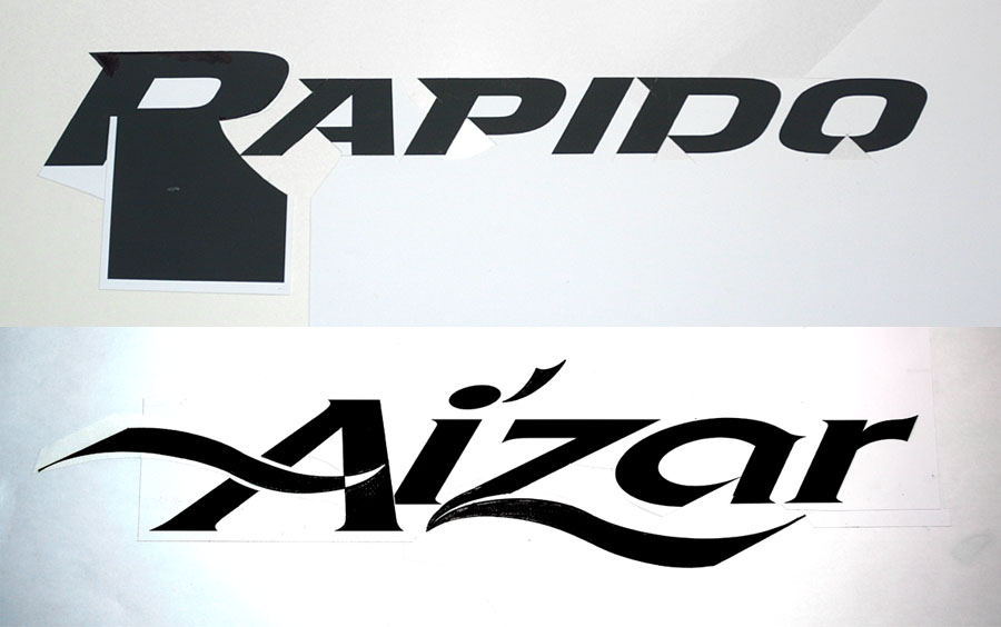
So, after my 38 years doing hand lettering and designing 229 career logo designs there are several ways to create hand lettering, but one method I use a lot when designing is one I call the “Subtraction Design Method”. This is a great old school paste up method of designing and creating a master logo that is fast, accurate, efficient and saves a lot of time.
The goal of any good logo designer in New Jersey is to create lettering that is totally unique, not just use a standard font out of the computer. Hand lettering skills are needed to achieve great typography and here is one technique I have developed over many years that works very well for me. First, I find a font I want to work with and that has the appropriate look and feel for for my client’s company or product. I first print out the lettering large, perhaps 14 inches wide using presentation quality Epson paper at high resolution. I use a waxer to coat the back of my Epson proof and a conventional drafting desk and cutting board but “One Coat” rubber cement will work also if you don’t have a waxer. I use tracing paper to make marks of where I want to make cuts and an adjustable triangle, then I cut into he black letter forms to remove parts of the letter that I want to chisel out, such as removing the standard cross bar of the letter A. I cut away the standard cross of the A, then I add my own custom curved, unique shape cross stroke on the A that is totally unique and not standard lettering out of the computer. I then hand draw my own custom curved A cross stroke first using tracing paper in rough pencil. I often do 3 rough sketches to find the best looking one. I then I trace my rough letter stroke using layout paper and render my custom strokes using ellipse and oval templates and a fine black ink pen ( Brands including Micron, Staedtler, Artists Loft, or fine Sharpie are all very good) to get a sharp black and white shape or cross stroke. I then wax the back of that custom stroke and using a new Xacto blade cut and and paste it into my core lettering at just the right angle and position.
Cutting away parts of the letters standard font elements to add your own custom appendages to a great way to work fast and try several different fonts for any given assignment. Working faster is important as time is money and we often can’t spend 40 hours on one logo design. This subtraction method is a great way to work fast and explore multiple creative typographic solutions. I then photo copy my rough but precision drawn lettering to erase any cut marks for presentation. This often requires some opaque white touch up paint of cut lines, but presenting the logos in black and white on 11”X17” copy paper is a great way to present multiple designs in the Phase 1, Preliminary Design phase of a logo design. I call these black and white design “Preliminary Roughs” because they are not yet reproduction quality, but using razor sharp pens enables me to actually work very sharp where my client and I can see very accurately what these special custom hand characters look like. It important to start a design in black and white and first establish the typographic design and not be influenced by color.
After the client approves one of my preliminary rough designs, I then repeat the process by working large (about 18” wide) for ease of rendering custom letters and instead of opaque layout paper I use drafting mylar to achieve razor sharp lines. I first cut away or “subtract” areas such as unique chisel cut angles on many letter forms. I use an adjustable triangle to insure each one of my unique angles is identical and precise. I then render any unique curved strokes on drafting mylar and cut and paste with my standard letters. When finished I retouch any imperfections two ways. First, I use an ultra-fine watercolor brush and opaque water base retouching white paint such as (Dr. Martins) to remove or retouch any black line imperfections.
I then scan my lettering at 1200 DPI (dots per inch) in Photoshop. I then adjust the contrast with my scan and can remove a few imperfections with a contrast adjustment. I then use the Photoshop pen tool to add or erase any other imperfections until the design is perfect. I then take my retouched Photoshop file a drop the dpi to 700 dpi (still very high quality) and import the file into Adobe Illustrator and use Image Trace to convert my hand lettering to vector art. Afer converting to vector art I now can color my lettering and or back ground to any Pantone color I want. I generally create 6-10 different color combinations and number them 1A to 10A for my client and present my logos on high quality 13”X19” Epson Presentation Matt paper. Using Rosetta software, I get very accurate Pantone color matched colors and always impress my clients with this best presentation method.
Ted DeCagna has designed 229 career logo designs to date and has earned 31 design awards for his custom hand lettered logotype solutions. He is considered a premier New Jersey logo Designer. Should you have any questions about Ted’s tips here and techniques, please contact Ted at Ted@tdgraphicdesign.net where he would be happy to answer any questions about his tried and true creative design techniques.
A video demonstrating Ted’s hand lettering skills can be viewed on his web site at https://www.tdgraphicdesign.net/logo-design/


Recent Comments