Ted DeCagna is proud to announce being selected by a leading national Graphic Design organization for 5 new Graphic Design Awards in April 2017. Four new logo designs and one new web site design have been selected. The five designs will be published in the upcoming hard cover annual, American Graphic Design and Advertising 31, Published 2017. All five new award winning designs can be viewed on Ted’s brand new state of the art web site at www.tdgraphicdesign.net.
Award winning logotype designs include: 1. A logo design for a company that specializes in X-Ray Diffraction Imaging Equipment, Rigaku Innovative Technologies, Auburn Hills, Mi, Category: Best logo Design. The logo will appear in American Graphic Design and Advertising 31 to be published in 2017. The challenge here was to design a simple, contemporary logo that communicated X-Ray Diffraction to the staff of physicists and clients. This was quite a challenge, but many hours of study and 24 preliminary designs, led to a mark that communicates well, has a contemporary feel and met the scientific approval of 7 company physicists.
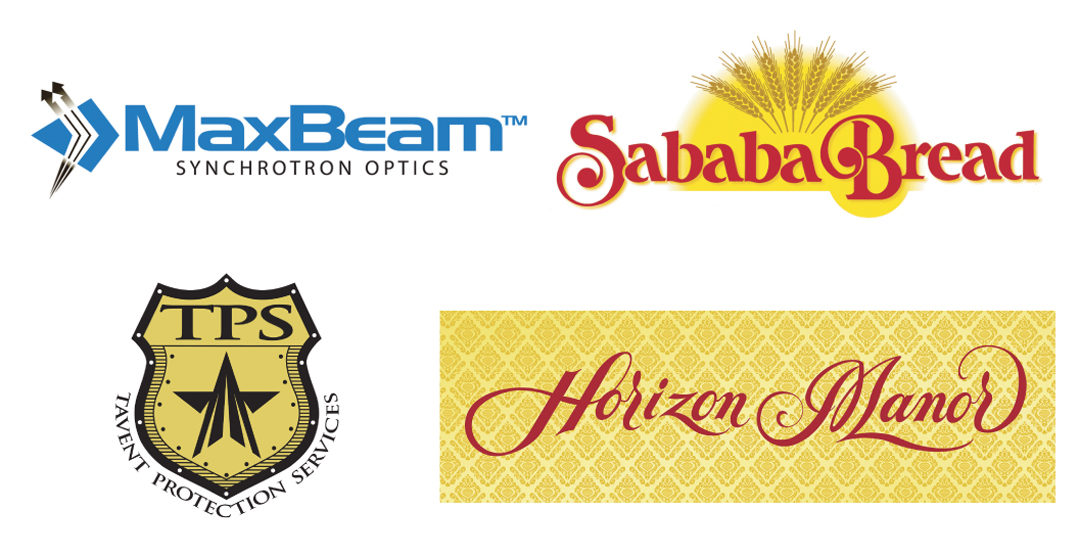
The second award winner is for a large commercial bakery in New Jersey,Angel Bakeries. The award was for a new, high quality flat bread product called Sababa Bread. The goal was to create a totally unique looking home-style logotype design that included a symbol with dynamic sun burst behind a circular burst of wheat stalks and a custom,stylized hand lettering. The logo will appear in American Graphic Design and Advertising 31 to be Published in 2017.
The third logo award is for a new, private security service in Jersey City,
New Jersey named Tavent Protection Services. The client wanted some kind of recognizable shield symbol with the letters TBS and a star included. Ted
customized a classic metal shield shape with metal rivets to accent the shield and designed a contemporary looking star with wrap around typography for the full company name. The logo will appear in American Graphic Design and Advertising 31 to be Published in 2017.
The forth award winning logo is for a high-end assisted care home in Upper Montclair, New Jersey called “Horizon Manor”. The award was for the logo created for two Victorian style manors. The old world,classy atmosphere of the homes inspired Ted to create an unique custom hand lettering with a spencerian script style and rich, gold Victorian textured background. The final result was a logotype that looked like a high-end hotel and conveyed the class and charm of their assisted care facility.
The final award winner is a new web site design for the same assisted care home in Upper Montclair,“Horizon Manor”. With the web site, Ted used the same Spencerian script hand-lettered logotype and rich, gold Victorian textured background on every page. Ted personally shot each photo including both exteriors and many interiors,including their living rooms, dining rooms, bedrooms and side rooms. An easy to navigate slide show enables prospective clients quickly view each room in each building. Ted used several stock photos of seniors, who have the typical look of their guests, but the decision to use stock was important to protect the privacy of actual guests. The logo will appear in American Graphic Design and Advertising 31 to be Published in 2017.


Recent Comments