ICE BREAKERS LEMONADE LOGO
Project Description:
Can a design actually influence strong feelings? The answer is absolutely YES! To make this case in point, Ted was recently given the challenge of designing a creative logo for a new lemonade business.
The business is called “Ice Breakers” in Cranford, NJ and is owned by Brandon Strawder, whose partner is his seven-year-old daughter, Belle. Belle entered a new lemonade business contest called, “The Country Time Lemonade Bailout”. Belle wrote a fantastic essay about why she would want to own and run her own lemonade business. Belle’s essay impressed the judges and she won the national contest that included funds from Country Time Lemonade to start up the business. The creative name came from the idea that Belle wanted the lemonade to be a social ice breaker to meeting new friends at town fairs where the product would be promoted.
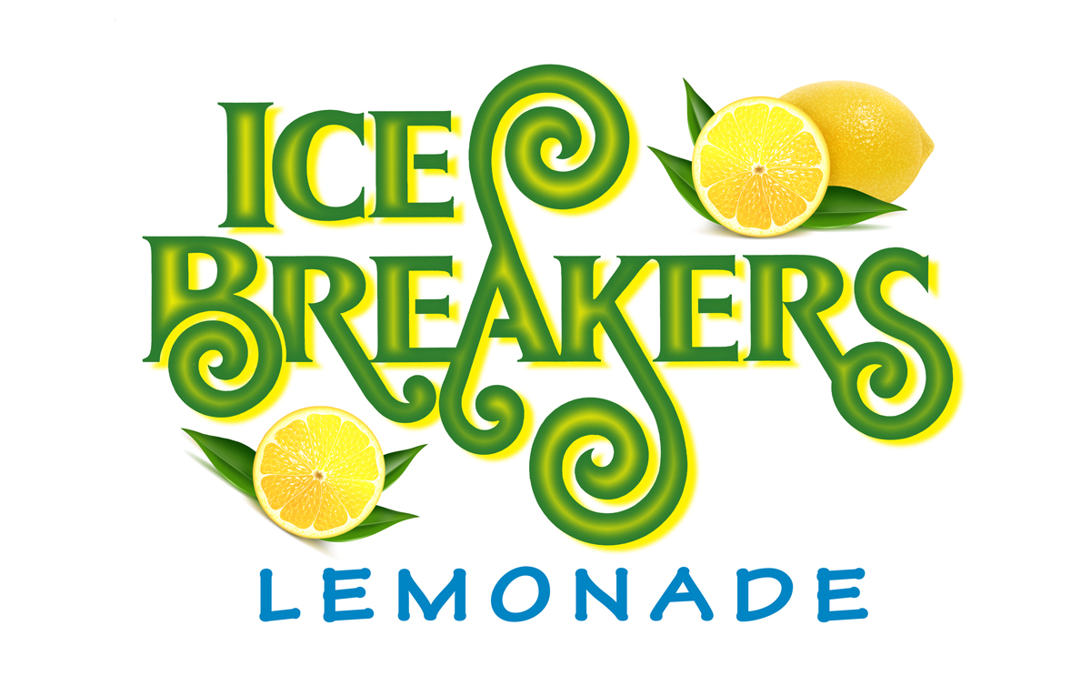
Ted DeCagna was chosen to be the designer. Given the challenge, Ted felt the logo should be very happy, fun, festive and unique. Ted used his hand lettering skills to create a logo with very creative, never before seen letterforms that have a playful, stylized feel supported with beautiful lemon and leaf illustrations, which he interlocked with the typography. Ted’s best solution, Image 1, was presented to the father and daughter team. When seven-year-old Belle was asked, “What do you like about this logo and what do you not like?” Her answer was instantaneous…
“I love the colors and shapes and lemons because they remind me of summer and make me happy!!!”. While Ted always presents several different logo design options to his clients, this solution was a clear and an easy favorite for both clients. Belle’s simple and vibrant endorsement of the logotype prove that good typography and design can evoke very strong emotional feelings that will very likely attract many customers to try the product.
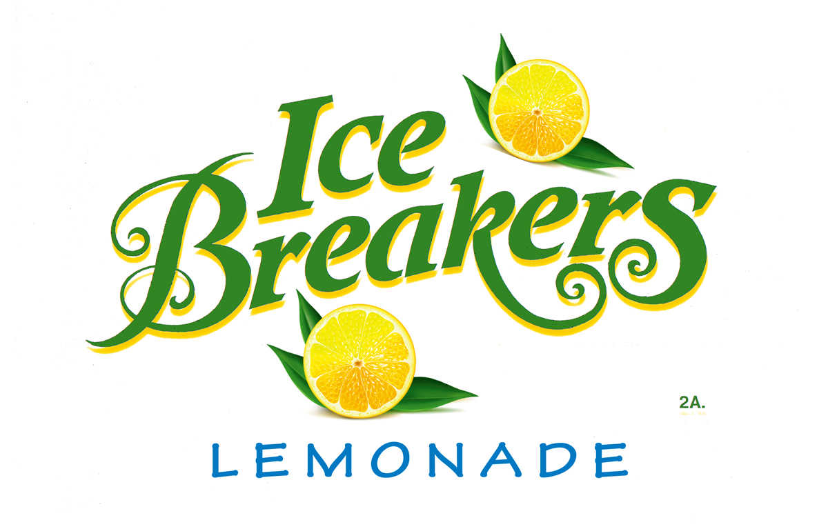
To enhance his lettering even further, Ted went the extra mile to create a special effect with yellow highlights in the center of the letters that help give the lettering a very entertaining 3-Dimensional effect. This special effect actually makes the swirl appendages of several letters look 3 dimensional by adding an even more exciting creative flair to the typography. Image 2 was the original design which all felt was still very good but given the 3D airbrush look special effect, design 1 was selected as the winner.
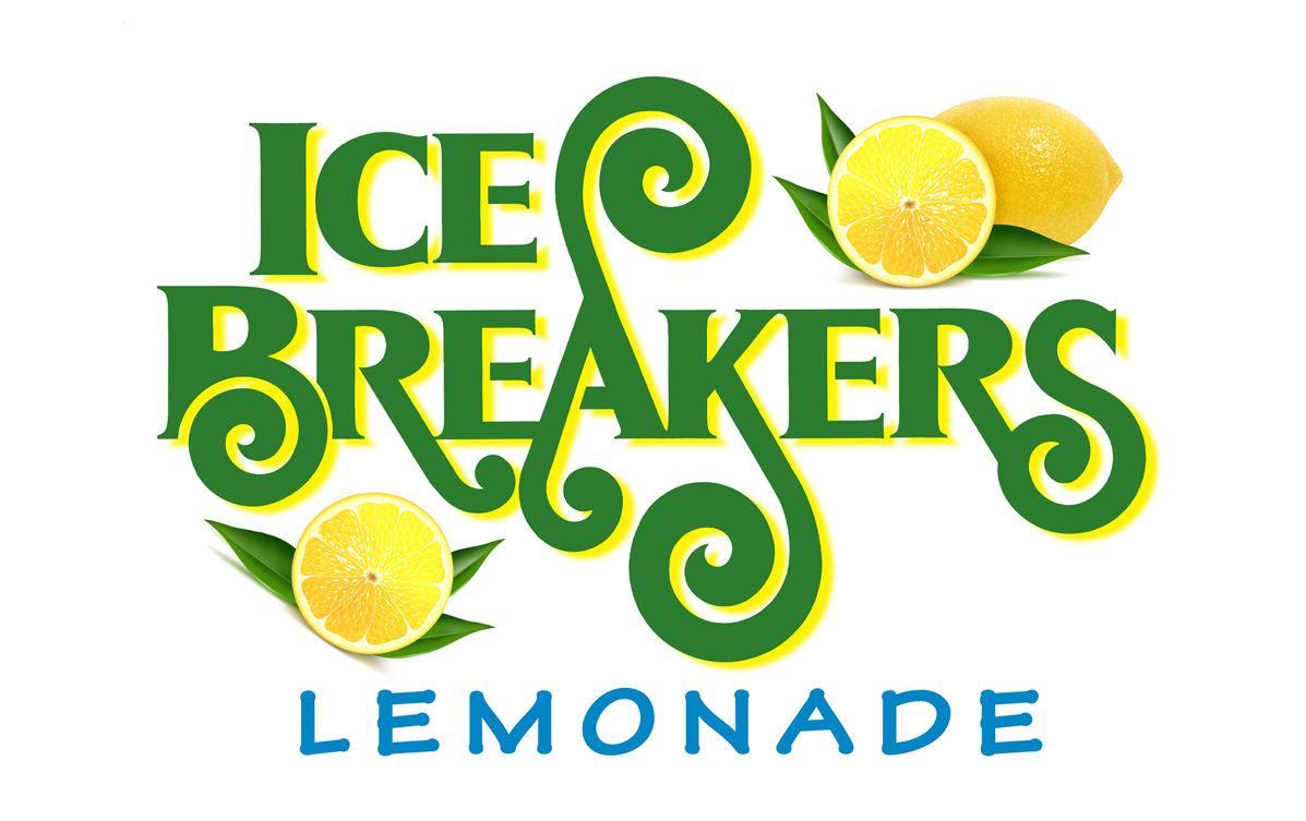
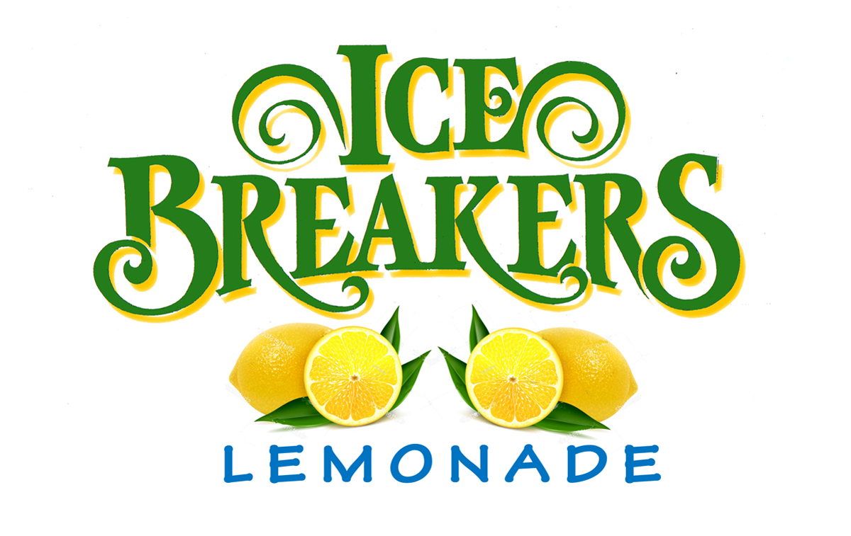
The alternate designs, image 3 & 4 also got good reviews but the image 3 “B” and the bold italic letters does bare a resemblance to the famous Breyers Ice Cream logotype and although the client really liked the design also, it was decided to go with the design that was totally unique with zero similarities to any dessert or food products.
The selected design will be printed on cups and town fair trade show signs throughout New Jersey for starters to attract thousands of customers. Many of Ted’s custom logo designs that were designed 20 years ago are still in use today proving good design lasts and is really a very reasonable investment for any business or product given the longevity of a good design.
and is really a very reasonable investment for any business or product given the longevity of a good design.
Business Type:
Project Challenge:
Services Provided:
Client Location:
Project Gallery:
Call or Email Ted DeCagna
Ted will speak to you directly and provide a quote promptly.
908.272.6777 ted@tdgraphicdesign.net
6 Edward Place / Cranford, NJ 07016


