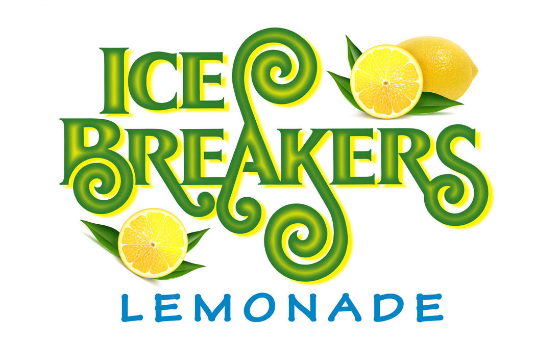
Ted DeCagna was chosen to be the designer. Given the challenge, Ted felt the logo should be very happy, fun, festive and unique. Ted used his hand lettering skills to create a logo with very creative, never before seen letterforms that have a playful, stylized feel supported with beautiful lemon and leaf illustrations, which he interlocked with the typography. Ted’s best solution, shown above, was presented to the father and daughter team. When seven-year-old Belle was asked, “What do you like about this logo and what do you not like?” Her answer was instantaneous… “I love the colors and shapes and lemons because they remind me of summer and make me happy!!!”. While Ted always presents several different logo design options to his clients, this solution was a clear and an easy favorite for both clients. Belle’s simple and vibrant endorsement of the logotype prove that good typography and design can evoke very strong emotional feelings that will very likely attract many customers to try the product
To enhance his lettering even further, Ted went the extra mile to create a special effect with yellow highlights in the center of the letters that help give the lettering a very entertaining 3-Dimensional effect. This special effect actually makes the swirl appendages of several letters look 3 dimensional by adding an even more exciting creative flair to the typography. The selected design will be printed on cups and town fair trade show signs to attract thousands of customers.


Recent Comments